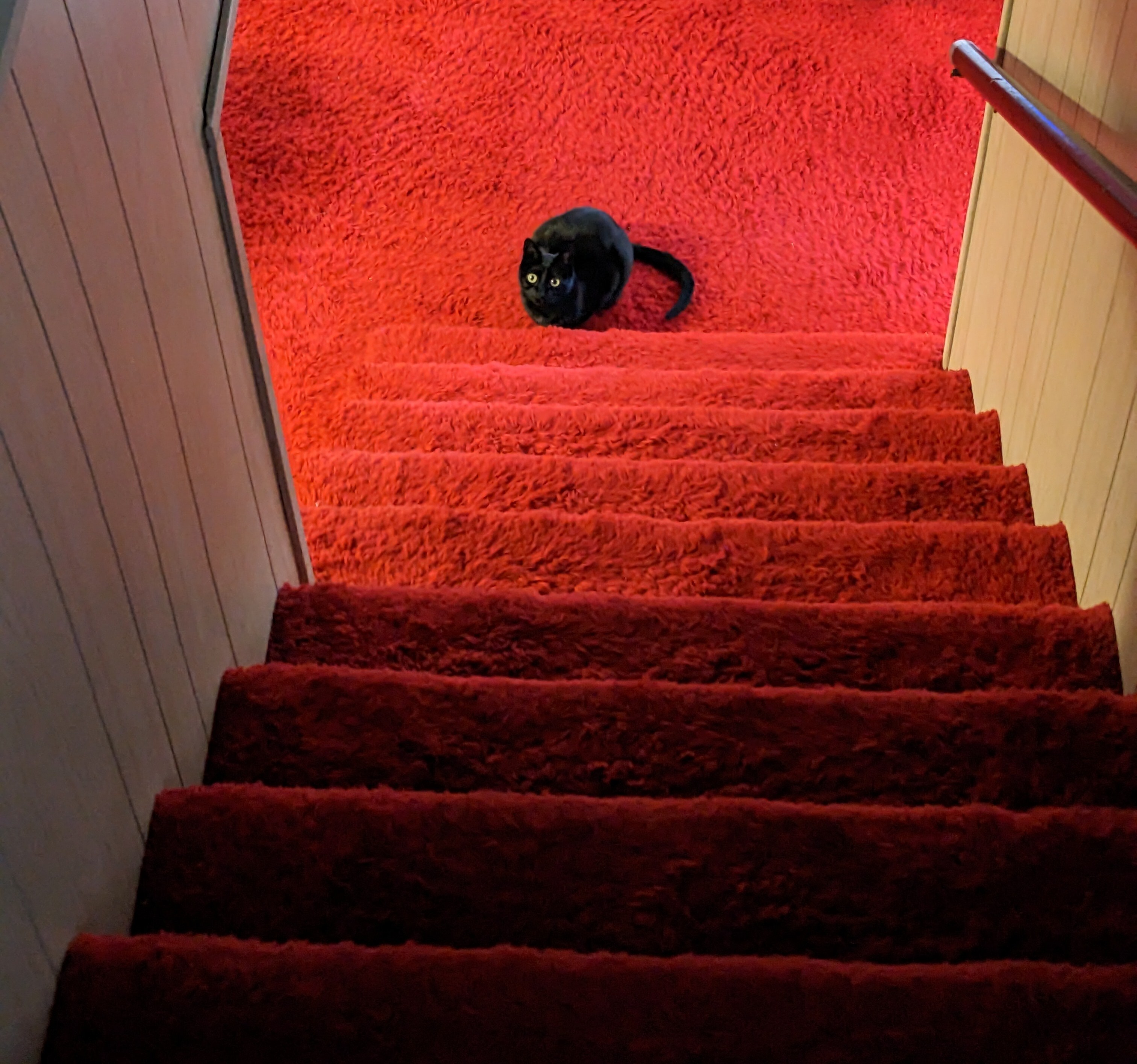
Some of us like red carpet.

Terrible photos listed by estate agents/realtors that are so bad they’re funny.
Posting guidelines.
Posts in this community must be of property (inside or out) listed for sale which contains a terrible element. “Terrible” can refer to:
the photo itself (finger over the lens, too far away, people in the shot, bad Photoshop, etc.)
the property (weird layout, questionable plumbing, unsound structure, etc.)
the interior (carpeted bathrooms, awful taste interiors, weird mannequins/taxidermies/art, inflatable pools indoors, etc.)
the actual listing itself including unusual descriptions and unrealistic pricing. However, this isn’t a community to discuss the housing market in general. This is a comedic community - let’s keep it light.
Photos can be sourced from anywhere and be any age, but please check they haven’t already been posted.
Censor any names/contact details of private individuals.
Mark the post NSFW if it includes nudity or sensitive content
Rules.
This community follows the rules of the feddit.uk instance and the lemmy.org code of conduct. I’ve summarised them here:
Some of us like red carpet.

It looks like the entrance to a satanic ritual led by Vincent Price
Look on the bright side, it's going to be easy to clean up after murdering the guy who made it
Honestly I like it. I really like that kind of wood paneling as it just gives me very cosy vibes for some reason, the ceiling contrasts that and feels bright, and the floor, while tacky, adds color in a way that I feel looks interesting. Red's not exactly the color I would have chosen, but I do think I'd have gone for a similarly bright color given the option. Carpet in the bathroom though, is just gross.
Me too. I was like "are they stunned by the carpet because it looks so good ?" I'm sure that color might show dirt more, but I'm fine with that because it let's me know to vacuum.
Edit: Uhhhhh I missed the carpeted bathroom in the corner left. That's no Bueno.
Yeah wood panels give me nostalgic feelings of my grandparent's house. Simpler times and such
As an added bonus, it runs all the way down the hall and into the bathroom.
Jesus that massive house is cheap af!
It looks so normal from the outside.
That house is so weird throughout, then the red rooms just hit like driving into a concrete wall.
This is the type of saturation cell phone makers are too cowardly to use
I love it. Until you see that the bathroom is carpeted...
I like it
I hate it but I love it. I wish I could switch between kitschy stuff like this and a less eye-stimulating/burning look at the push of a button
That gum you like is coming back in style
Why do I like this. Is there something wrong with me?
The carpet is one thing. What about the pink bathroom fixtures?
TBF, I kinda dig it, pain in the ass to clean tho
The house my parents bought when I was a teenager had red shag carpet. You wanna talk about horrific
This one looks fairly shaggy in some photos...
When you really want the floor to be lava.
The carpet and walls look like those in the den where I grew up, before we turned it into my bedroom and replaced the carpet with something more neutral brown. I was fine with the red but it was a rough shag that was in really poor shape. Then again, I suppose a good cleaning might have saved it and saved money but my mom was more the one dictating the style despite it being my room.
a rough shag that was in really poor shape
we've all been there on a friday night
Love it
Looking at that picture is all I needed to know exactly how that home smells. Musty with a hint of piss.
I like it!
What's with the fat toilet?
You question the distortion, but not the fact that there IS CARPET IN THE BATHROOM?!!!
Wide angle lens distorting things horizontally
Ah okay, thought I was missing out on more pompous ceramic thrones.
Cornhusker Carpet! Im surprised theres not a big N in the middle of it.
The whole house has some interesting choices, some of which work well together and others... not so much. Most of it would have cost a lot when it was done, and seems to have been very well cared for since.
It would make a cracking movie set, and I kind of hope the new owners do something sympathetic to it and keep the better bits, though that's unlikely.
Can't really imagine who would have lived here, other than that they're probably in their late 80s now, and that they had at least three children. The ad said something which suggests the owner is a builder and that their building company built it.
Then stop looking at it
It's really the walls being that color. A more neutral gray or white could work. Heck, even a pale pink or orange. Anything but brown.
Edit: Is that a freaking fish on the wall!?
Going for those Stanley hotel vibes.
Shitstain color of crimson shits...