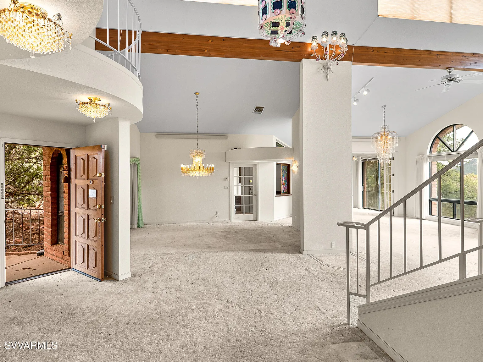
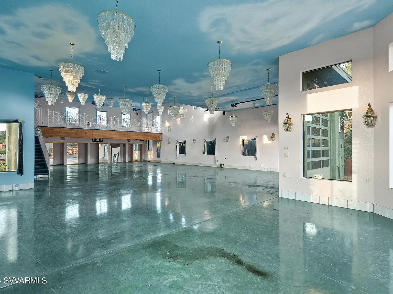
Jeez. At first glance I thought that first pic was an indoor swimming pool.
Terrible Estate Agent Photos
Terrible photos listed by estate agents/realtors that are so bad they’re funny.
Posting guidelines.
Posts in this community must be of property (inside or out) listed for sale which contains a terrible element. “Terrible” can refer to:
-
the photo itself (finger over the lens, too far away, people in the shot, bad Photoshop, etc.)
-
the property (weird layout, questionable plumbing, unsound structure, etc.)
-
the interior (carpeted bathrooms, awful taste interiors, weird mannequins/taxidermies/art, inflatable pools indoors, etc.)
-
the actual listing itself including unusual descriptions and unrealistic pricing. However, this isn’t a community to discuss the housing market in general. This is a comedic community - let’s keep it light.
-
Photos can be sourced from anywhere and be any age, but please check they haven’t already been posted.
-
Censor any names/contact details of private individuals.
-
Mark the post NSFW if it includes nudity or sensitive content
Rules.
This community follows the rules of the feddit.uk instance and the lemmy.org code of conduct. I’ve summarised them here:
- Be civil, remember the human.
- No insulting or harassing other members. That includes name-calling.
- Respect differences of opinion. Civil discussion/debate is fine, arguing is not. Criticise ideas, not people.
- Keep unrequested/unstructured critique to a minimum.
- Remember we have all chosen to be here voluntarily. Respect the spent time and effort people have spent creating posts in order to share something they find amusing with you.
- Swearing in general is fine, swearing to insult another commenter isn’t.
- No racism, sexism, homophobia, transphobia, xenophobia or any other type of bigotry.
- No incitement of violence or promotion of violent ideologies.
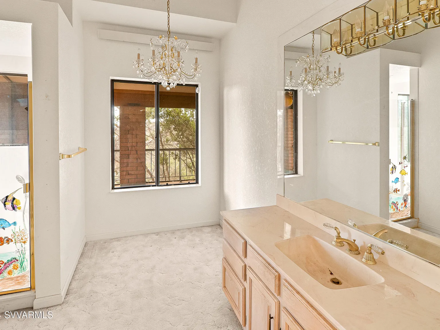
There's even fish stickers on the shower door lol
So what is the pic showing then, just a polished blue floor in some living room-type area?
I'm guessing it's supposed to be a... dance hall? Or maybe a big dining room or something? But yeah. I think it's just a polished floor.
Why would you paint the sky on the ceiling and then add chandeliers?! It feels like a fallout bunker.
Delusions of Versailles, on a budget.
Paris, TX was not enough so they made their own Versailles, AZ
I find a cloudy look in them.
This seems like a fake house that's just for hosting parties lol like I can't imagine someone actually living in such a ridiculous space
And they're ALL DIFFERENT
Seriously, how did they find SO MANY completely different chandeliers?
It's like it's a chandelier display store for very elite customers.
Feels like an episode of Interdemensional TV from Rick and Morty
Maybe it's a collection
I think whether it was intentionally one or not, it's become one
It's got some "backrooms" / liminal space vibes.
My first thought. Definite Poolrooms energy.
It's like a "cheerful" house of leaves
Things like this remind me that rich people have the absolute worst fucking taste imaginable. Assuming they have any taste beyond "maximally expensive" like they're pre-modern nobility.
The carpet in the bathroom is the bigger problem
I have encountered that so many times in otherwise normal houses. I don't get it. Toilets can overflow, showers and sinks can leak. Why would you do that?
Some people really enjoy a slowly rotting subfloor?
I mean I don't, but...
My house had carpet when I moved in. Fuck - and I cannot stress this enough - that noise.
Ours too. Most of it has been replaced with laminate flooring. Nice to be able to clean a floor with a broom and you can deal with most stains with a mop.
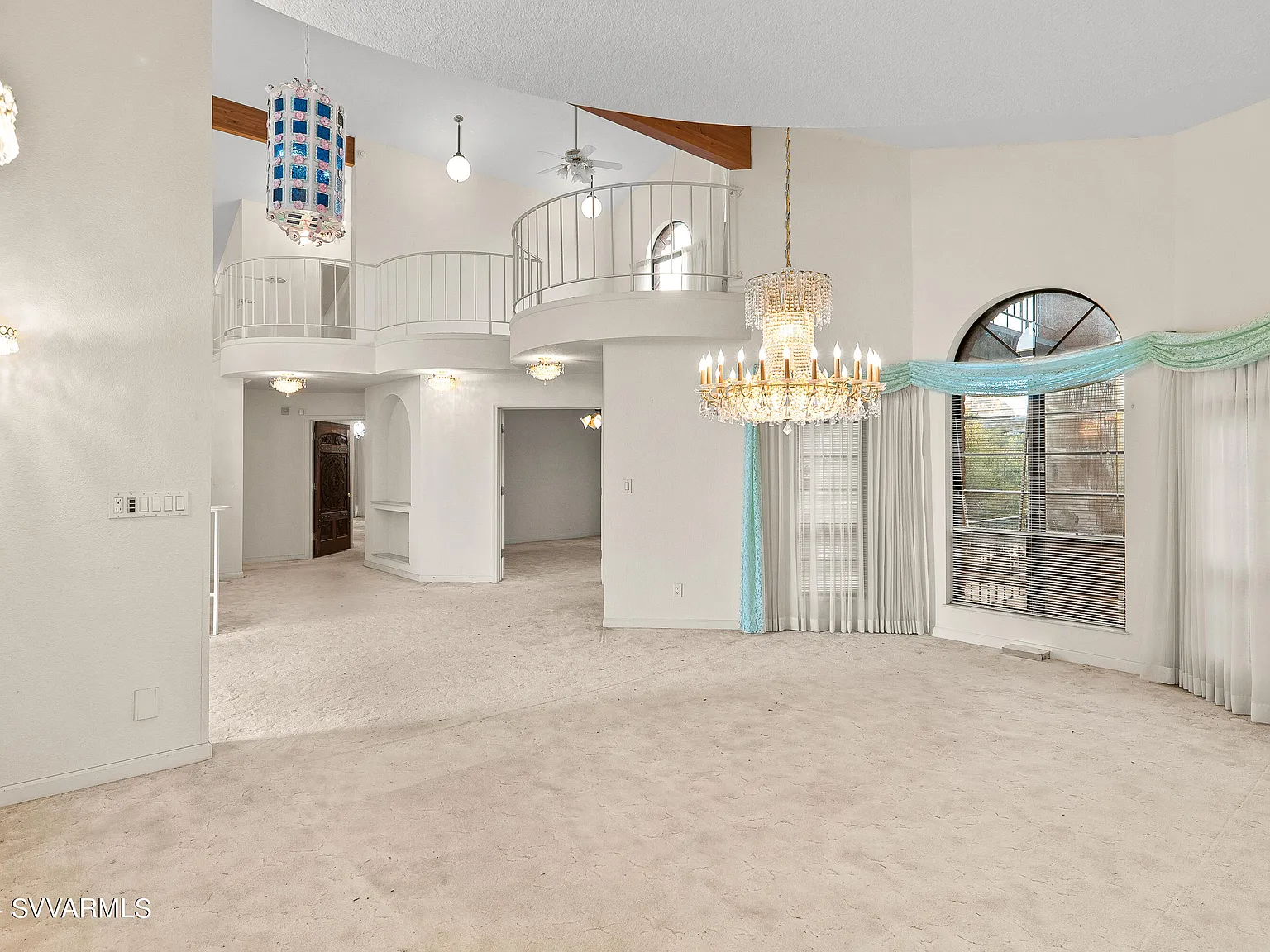
The location is magnificent but everything about the house is naff - not just the chandeliers but the curtains, the kitchen, the balconies, the archways, even the outdoor area. The temptation would be to knock it all down and put in something more open to take advantage of the vistas.
It feels more like a community center than a home
With all the chandeliers you sure to have at least one not working in a given time.
Cozy little place, I do hope 27 parking spaces would be enough. The scenery is outstanding.
The cover photo looks like an AI generated image since it doesn't understand the appropriate number of light fixtures.
they should make counterstrike levels out of bad real estate like this
i think someone just took counterstrike levels and made bad real estate out of them
They bought one and Amazon fucked up and sent a pallet.
Loving the clouds painted on the ceiling. Did a five year old design this house?
No way, this is peak Boomer, guaranteed.
Sedona, AZ. Say no more.
I guess when you have double-height rooms, you have to use that space for something.
In this case, they went with weather formation
I thought it was filled with water from a hurricane at first glance
The thumbnail made it look like a pool with chandeliers, I'm not sure this is better.
The first pic makes me think of Eastern Europe / just straight up Russia
That carpet is filthy. They didn't even vacuum it.
I'm not even sure if that's carpet.
Does it come with a roomba drone to dust all those chandeliers?
is this place flooded?
Is the first pic supposed to be a garage?
Well, if you have high ceiling rooms, a chandelier looks better than some flat lights somewhere up there.


