or... just use darkreader :D
AssholeDesign
This is a community for designs specifically crafted to make the experience worse for the user. This can be due to greed, apathy, laziness or just downright scumbaggery.
Seconding. Can't imagine not using darkreader in this day and age.
Yup yup. Darkreader has improved my entire internet experience, which is a huge accomplishment. Works flawlessly 99% of the time.
Dark reader is great. It can also be used to prevent fingerprinting based on your preference, as most are configured to light mode by default.
However it often makes the site nearly or completely unusable, as it isn't (and can't) always be 100% correct. Having dark mode configured by the site is often much more useful.
somehow, the "dark reader clone" that's in samsung browser it's so much accurate. Main disadvantage is that you have to use samsung browser (ugh)...
DR itself is clearly fingerprintable, more so than a dark preference.
or... just lower your monitor brightness so you don't feel like you need dark mode, which is actually worse in every way than just using the correct monitor brightness.
With everybody using black pixels, they're becoming more expensive as they rarefy worldwide. This kind of thing was to be expected, really.
I've seen this in many places. I don't remember them because I stop caring when I notice the cut of their jib.
Dextero is pretty trash in general so I'm not surprised in the slightest. So much bot content on there
Not a regular visitor, so can't say anything about there content.There was a discussion in the piracy community about the article, so went there to read it: https://www.dexerto.com/tv-movies/godzilla-minus-one-most-pirated-movie-2696285/
Sorry I didn't mean any negatively towards you there. I just remember what the site was like before it hit my blocklist. It was before chatgpt got big but everything I read on there was scraped info from other sites and full of errors
Sorry I didn't mean any negatively towards you there.
I took your previous comment to be a critic of Dexerto.Not towards me. No apology needed.
Thanks for warning me about their quality, its now on my blocklist too.
No prob..I avoid RockPaperShotgun, too, because 90% of their articles are thinly-veiled ads
Arstechnica does this crap too.
Ars dark mode switching is infuriating, not an asshole design choice like Dexerto here
Be me,
-
Click on an article link in rss feed.Open in browser(in dark mode)
-
Ars technica doesn't change its theme.
-
Open the menu to switch theme, click on dark mode.
-
Goes to the homepage in dark mode.
-
Go back to rss reader click that link again.
That's a lot. I will stick to Dark Reader
Lots of websites do this the other way around, too. It's very annoying.
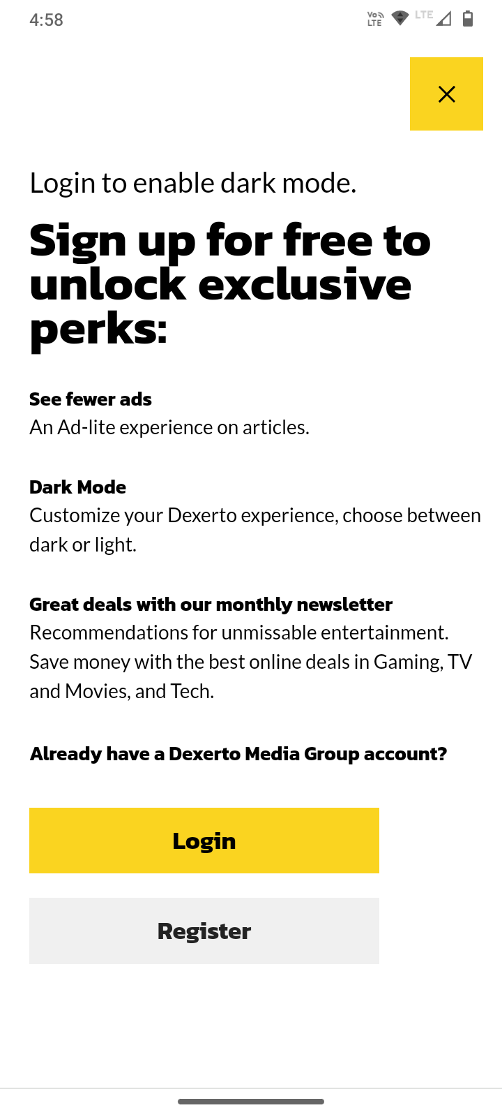
What, you have to enable dark mode to sign up?
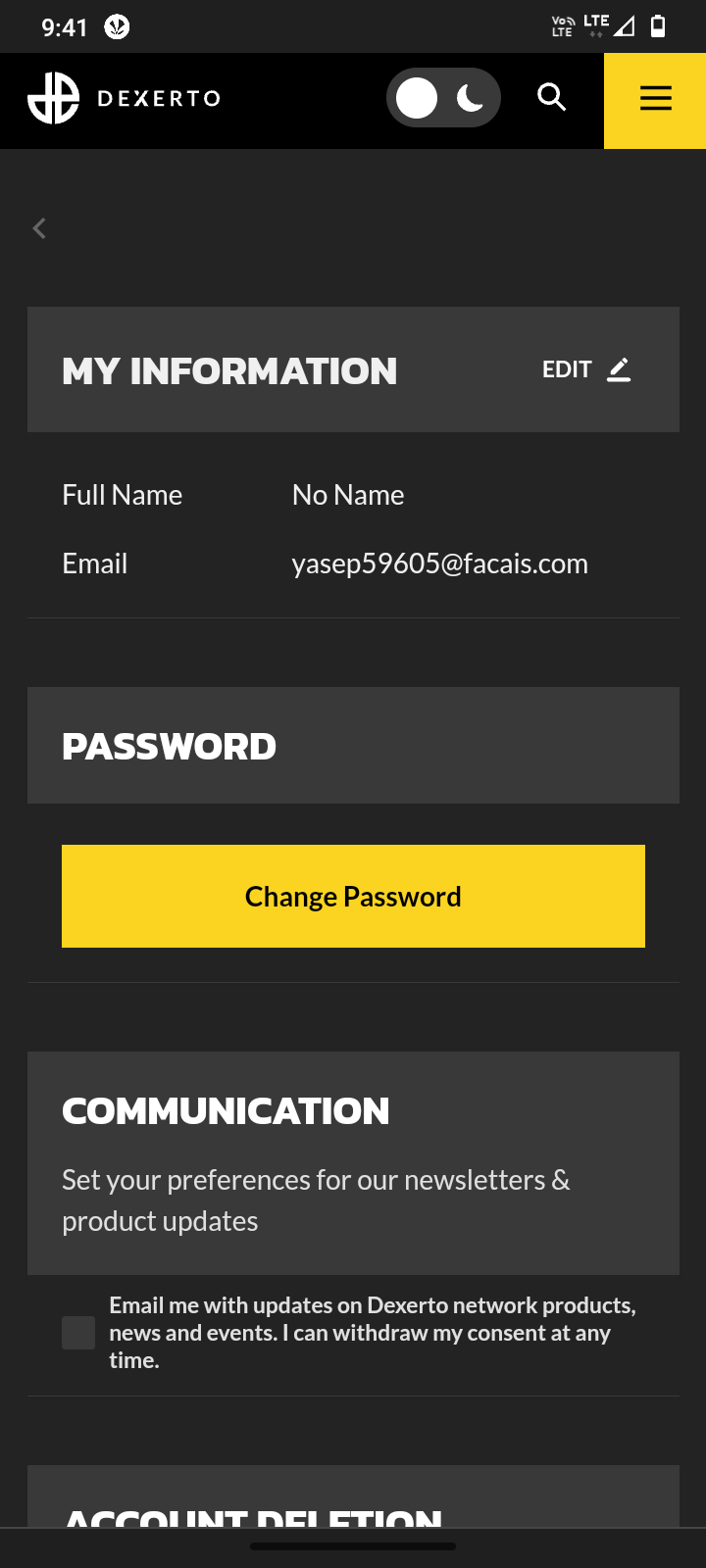
No lol just you need to sign up to enable light mode
Firefox with the extension "Dark Reader" is great. There are some websites I have to disable it, but it's rare. I also recommend uBlock Origin.
Edit: I see someone already recommended dark reader. But it really is a must have extension. It knows if your system theme is set to light or dark and matches it automatically.
CSS is so premium lol
same with news.google.com
they won’t even turn off the ads if you pay them. what a joke
edit: oops i just saw that these are the “free benefits”
there was a android apk site that did that


