this post was submitted on 16 Mar 2024
1010 points (98.5% liked)
Memes
45660 readers
1522 users here now
Rules:
- Be civil and nice.
- Try not to excessively repost, as a rule of thumb, wait at least 2 months to do it if you have to.
founded 5 years ago
MODERATORS
you are viewing a single comment's thread
view the rest of the comments
view the rest of the comments

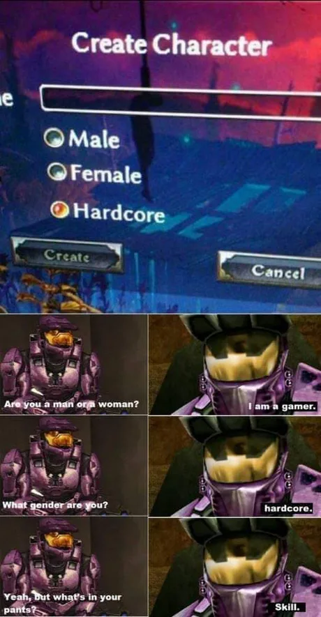
I truly thought this was supposed to be a third gender and they didn’t want to call it ‘other’ to not sound dismissing.
Man, round checkboxes are dumb.
My assumption would be that the gap between Male and Female is much thinner than to the Hardcore option. Thus it's a new option group. And an option group with only one choice is invalid thus is has to be a checkbox.
I just assumed the option for normal difficulty was to the left and that's why the image is weirdly cropped like that.
There is a gap between the male and female grouping and the hardcore. This is what leads me to believe that the hardcore option is in a different grouping, probably horizontal grouping which is why I think the normal difficulty is to the left.
Why would the gender selection me aligned vertically, but the mode selection horizontally?
Well seeing only 15% of the screen it's hard to say. Could make design sense or could be bad design, or I could be wrong.