this post was submitted on 15 Aug 2024
384 points (91.2% liked)
Memes
45655 readers
1703 users here now
Rules:
- Be civil and nice.
- Try not to excessively repost, as a rule of thumb, wait at least 2 months to do it if you have to.
founded 5 years ago
MODERATORS
you are viewing a single comment's thread
view the rest of the comments
view the rest of the comments


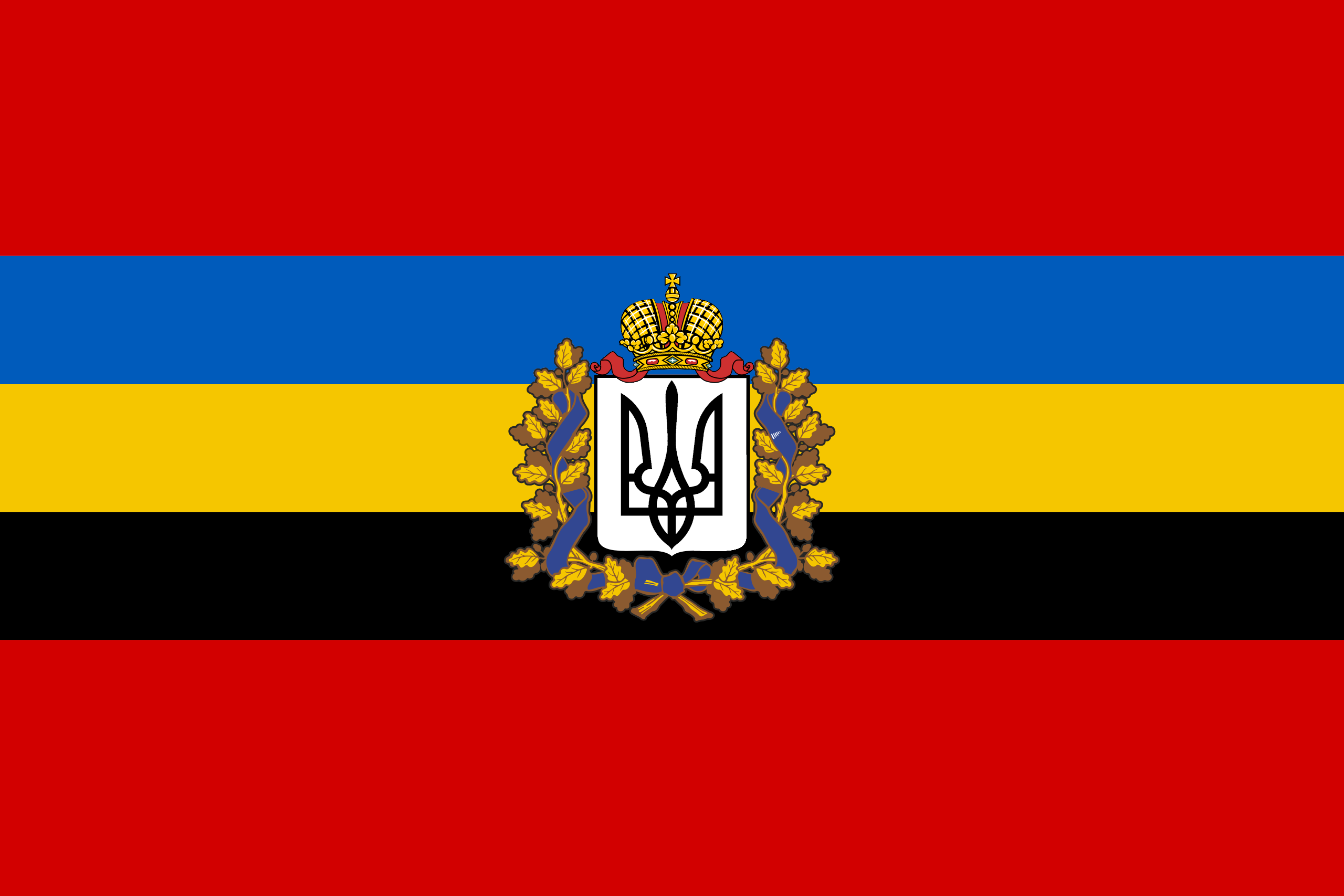
That emblem brings this from a solid B+ flag to F-
Its not a bad design, but those don't belong on flags.
I personally like emblems, icons and heraldry on flags. Without them, flags are often enough just bars of colors.
Without it many personal wouldn't have recognized that it's not the original flag.
Intresting. I'll be honest, I have zero knowlage about the new flag or the nation (which I should fix...)
I just judged the flag as a flag.
In that case I as your student wouldn't accept F- as a grade, because you didn't see the original flag with three pigeons and a blue line in the middle. But ok.
I agree. It could work if the emblem was simplified, but it's a bit too complex right now. Not F- level though, I'd say C; the colours are unique with meaning, and the icon in the middle is striking and recognizable.
I agree. There are way too many clashing colors. It would be better if they reduced the number of colors. I could even go with reduced colors and the crest.