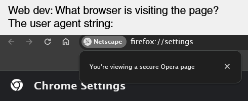
Google UI devs will do anything but follow their own material guidelines
Xylight
Just a tip, you can make those iamge links display inline by doing this:

I like the layout but the design is worse, you have to reach even further up to access search. the colors also look slightly worse imo.
Buying a nice domain and it actually being used is such a good feeling
I think that's the app you're using.
A feature that's be nice is giving you a higher upload limit if you make your upload temporary.
I feel like saying nothing but undefined is worse.
Younger than the iphone 👶
photon doesn't directly communicate with the backend, it's not intended for that. but even then, lemmy-ui is almost entirely client side (for some reason) and it makes its calls to the API
For mostly all of my app-launching things I always prefer searching for text than searching for an icon. In pixel launcher, I always use the app drawer search, but an even better solution is in something like Niagara launcher.

Padding is a very versatile thing in UI design, and none of it will make anything look terrible.
Even in your first example, the toolbar has slight padding on the edges and so do the buttons.
The reason there's more padding now is because it makes it easier for new users to process everything.