Programmer Humor
Welcome to Programmer Humor!
This is a place where you can post jokes, memes, humor, etc. related to programming!
For sharing awful code theres also Programming Horror.
Rules
- Keep content in english
- No advertisements
- Posts must be related to programming or programmer topics
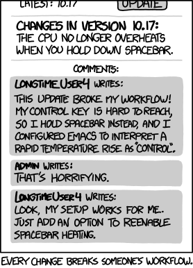
There's always a relevant xkcd. Lol
This is such a masterpiece from xkcd
I still can't do half the stuff in the windows settings app that I could in the control panel, and every update removes an option in control panel without an adequate replacement.
Inb4 "use Linux" I DO but Nvidia and Wayland is still BORKED (even with v555) and when I'm done with work I just want to load up a game and not have to fuck with drivers and never actually play. Sue me.
I'm 100% linux, even on my work PC, but I will spare you the evangelism. lol
It's pretty safe to look at Microsoft as a shining beacon of what not to do when it comes to (re) design. I'm not an Apple fan, but I do respect that OSX has basically just had incremental / evolutional UI changes since it was first released. Any major differences (AFAIK, anyway) were slowly and progressively implemented over several versions.
I was an Apple fan for most of my life. And then Jobs died. The man was a huge asshole by all accounts but he sure knew how to design. Since then Apple has become just another tech giant making average products driven by business majors.
Jobs was our asshole. New version of OS X would have issues and they'd fix stuff through point releases and things I noticed, he also noticed.
I'm not convinced that Cook knows how to use a computer. And he certainly didn't know how to deal with Ive, which boils down to knowing software vs hardware.
I’m about ready to rehome my RTX 2080 and get an AMD card so I don’t have to deal with Nvidia’s proprietary garbage or the shit-tier open source drivers.
Same boat brother ... don't let the hivemind bother you. I deal with an oracle linix at work for 8h a day, when I get home I don't want to spend time fixing my own shit ... even if it's going to be better in the long run.
I'll switch to Mint the second ricochet anti cheat has native proton support ....
Nice try Microsoft, I still don't like your monthly "small" ui changes that hide the features I use and add extra "get copilot now" buttons
Nice try Microsoft
That's the most insulting thing anyone has ever said to me. 😆
They even put a "Github CoPilot" button to Visual Studio FFS. Fortunately they at least added an option in the config, which unlike most UI elements in VS requires a restart. But at least it can be removed I guess.
Didn't think MS would enshittify VS because "Developers! Developers! Developers!" but here we are.
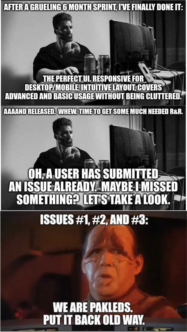
This is what I imagine the Reddit developers think of themselves as. 😆
Ouch! 😆
Yeah, I'm sure that almost all of us have felt this way at one time or another. But the thing is, every team behind every moronic, bone-headed interface "update" that you've ever hated also sees themselves in the programmer's position in this meme.
Oh for sure.
The meme is just a very exaggerated tale of moving a tacked-on, added-at-the-absolute-last second button from the previous release into the action menu where it should have gone originally. It's an in-house application, and the people that complained are also the type that will bold an entire page because "it's important". lol
In all my life I've only experienced one UI overhaul that I considered an improvement, and even then there were a few specific features that were a step backwards, even by proper design standards (the same action did two different things in only slightly different scenarios.)
Buuiuuuut I know half the time it's just because I'm used to the old way, only the other half is it some corporate bullshit trying to push a feature no one asked for.
Yeah, I get that completely. Which is why I rarely, if ever, overhaul the whole interface.
Pretty much every change is a refinement rather than a complete redesign. In this case, the complaint was because I moved a button that was just kind of tacked-on last minute in a previous release into the action menu where it should have gone to start with. lol
So. How long have you worked for Google? Not in years; in chat apps.
What's the difference?
A year lasts longer
Yeah, what you have to remember is that most users are pretty dumb. They don't know how the software works, just where the buttons are to do the thing they want to do. They don't read anything or learn anything other than what is needed for some menial task, and that they're only employed because the company they work for is too small for it to be automated.
If your stuff is free then do what you want, but the second you start charging money for stuff, you have to be acutely aware that the change that makes sense and makes everything neater and cleaner is going to make some 65 year old in an office freak the fuck out because now they can't do their job because their buttons have moved or the icon has changed.
Hrm, I would argue that if your update gets in the way of productivity on the user side, then it's actually worse, not better.
Sure, in a vacuum it might be superior, but that is now what is happening.
We used to rail against our users always wanting an Excel like view for everything, but when you observe them working to understand their work flow it makes sense. They use excel the other 75%of the day, we're the one breaking their mental flow and ruining their productivity.
Just because someone got used to walking around on their knuckles doesn't mean walking upright isn't easier and better overall. Sure, it will be difficult, it will be uncomfortable, and they'll have to get used to it before they see any improvement, but once they get past those hurdles even they will be amazed at how fast walking upright can be. And in the meantime, no one else who already has a tendency to walk upright will have to go through the pain and inefficiency of walking on their knuckles.
These people don't get to pick whether they use Excel, either. They have to, they just want to get their job done and go home, too.
They don't get paid to walk upright, basically. So why do it just so someone else can buy another yacht?
Some people don't have time to learn new workflows at their job. Their workload is maxed out with the workflow they currently have and while their boss may understand they need time to learn a new workflow, the bean counters up the chain won't. Maybe their replacements will get trained on the changes you made but the current ones are fucked.
The trouble is that, apparently, "perfect UI" can mean "let's take all the sidebar tabs, remove their text labels and make all their icons really abstract and in the same colour. Oh, and change their order, too, while you're at it."
Thank you from the bottom of my muscle memory and pattern recognition. Now, give us back our old UI that was actually meaningful, or at least make it an option if you insist that your "clean look" is more important than actual usability.
^(Apart from that, I love you JetBrains.)
And that's why you don't have a 6 month sprint...
Yeah holy shit! I hope this is a made up example. A six month sprint where you change literally everything about your UI? No wonder customers are upset!
the user is always right
Yep, lol.
- The user is always right
- The user has no fucking clue what they want
I hate how both of those things are true at the same time 😆
It isn’t always that they don’t know what they want, sometimes they just don’t know how to describe what they want, or they may know what they don’t want.
The user is always right about what they are willing to spend money on. That doesn't mean they know what they want, although a lot of people don't want to change.
That doesn't mean all change is good, and it isn't like any UI will ever meet everyone's preferences. For example, I hate adaptive design interfaces that are significantly different in confusing ways on different resolutions. Like I understand switching a static menu to an expandable menu, but not moving the relative location of certain buttons from the bottom of the screen to the top or vise versa. But that might make sense for some use case that isn't how I interact with it.
The user will forget about the old UI after 2 weeks.
I still constantly bitch about not being able to pin the taskbar to the side of the screen in windows 11.
There will always be some static-friction to UI changes, even if it's a change that makes the UI more accessible overall. Everytime you alter your UI you're taxing your users as it will take them some time to adapt to the new system. You should minimize how often you do this for that reason. Additionally, sometimes you may be unaware of an unintentional feature users appreciate that you're depreciating.
I dislike your comment because it's making a lot of sweeping generalizations (like that the UI changes are actually good) and ignoring the fact that users may have legitimate complaints.
If this were true we would still be riding horses.
Sometimes this is true, but sometimes UI updates really are just bad. Euro Truck Simulator 2 redid its UI in 1.50 and it's so much harder to use. Everything used to just be convenient buttons and information on the main menu, now everything is in really confusing menus and even though it's been out for a few months now I still have so much trouble using it and it feels so good to go back to an older version with a good UI. (Also the new UI is just horrendously ugly because they made everything completely flat but that's just personal taste I guess)
