this post was submitted on 07 Mar 2024
653 points (95.4% liked)
Programmer Humor
19564 readers
1364 users here now
Welcome to Programmer Humor!
This is a place where you can post jokes, memes, humor, etc. related to programming!
For sharing awful code theres also Programming Horror.
Rules
- Keep content in english
- No advertisements
- Posts must be related to programming or programmer topics
founded 1 year ago
MODERATORS
you are viewing a single comment's thread
view the rest of the comments
view the rest of the comments

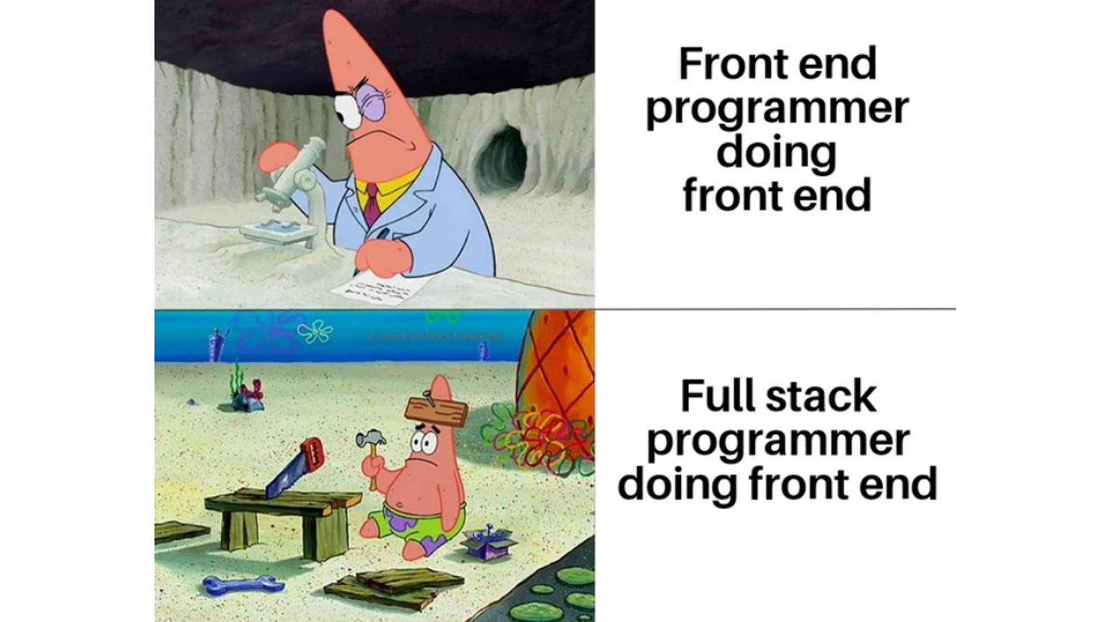
Backend Requirements: "When x,y goes in, I want x+y to come out!" - Okay
Frontend Requirements: "Well it needs to be more user-friendly, and have this rockstar wow effect" - Yea wtf are you even talking about? You want me to add random glitter explosions, because I found a script for that, that's pretty 'wow effect' right?
Actually the front end stuff is more like "we need to make the 'sign in' button bigger. No one can click it because it's tiny, and it's in German."
I spent years as a mobile developer and the thing that always drove me the most nuts was being handed a software design with lots of tiny buttons that were nearly impossible to tap with a finger. I generally implemented the UI by increasing the size of the tappable regions (without increasing the apparent size of the buttons) making it actually usable, but one time the designer discovered that I was doing this and went apeshit and convinced the project manager to order me to undo all this and make the tappable regions the same size as the buttons. The grounds for this was that implementing the larger tappable regions would take too much extra time - despite the fact that this had already been done and it took additional time to undo it.
So wait you actually had to undo it all? What kind of designer would make mobile buttons small?
I usually just do what they requested and when they come to complain I just tell them "well, you're the one who requested this" and pull up receipts. My DM to myself on Slack is filled with screenshots and links to confirmations for bullshit requests that the product team made.
How good does it feel when you pull out those screenshots to say, 'no u'?
Have you ever used a mobile app? Every commercial mobile app I've ever used has tons of tiny fucking buttons.
Someone who has tiny fingers
Fucking apeshit craze-balls, makes sense, business as usual.
Marketing want us to add more typos to make the site feel more “friendly”.
As a SaaS founder I'm now wondering if this actually works. Will have to talk to the front-end devs on Monday.
Please don't
Plese donot
Isn’t our main audience German? If you wanted non German stuff you shoulda asked for regional translations. Not only is that a change request, but you’re gonna be pushing the release window by months.
But it doesn't even say "Sign in" in German. It says "Das Bootton" because someone thought it would be funny and never changed it.
That someone was RIGHT!