Android
DROID DOES
Welcome to the droidymcdroidface-iest, Lemmyest (Lemmiest), test, bestest, phoniest, pluckiest, snarkiest, and spiciest Android community on Lemmy (Do not respond)! Here you can participate in amazing discussions and events relating to all things Android.
The rules for posting and commenting, besides the rules defined here for lemmy.world, are as follows:
Rules
1. All posts must be relevant to Android devices/operating system.
2. Posts cannot be illegal or NSFW material.
3. No spam, self promotion, or upvote farming. Sources engaging in these behavior will be added to the Blacklist.
4. Non-whitelisted bots will be banned.
5. Engage respectfully: Harassment, flamebaiting, bad faith engagement, or agenda posting will result in your posts being removed. Excessive violations will result in temporary or permanent ban, depending on severity.
6. Memes are not allowed to be posts, but are allowed in the comments.
7. Posts from clickbait sources are heavily discouraged. Please de-clickbait titles if it needs to be submitted.
8. Submission statements of any length composed of your own thoughts inside the post text field are mandatory for any microblog posts, and are optional but recommended for article/image/video posts.
Community Resources:
We are Android girls*,
In our Lemmy.world.
The back is plastic,
It's fantastic.
*Well, not just girls: people of all gender identities are welcomed here.
Our Partner Communities:
view the rest of the comments

I don't like that, I love that definitely an improvement over A11 visuals (only its QS were better talking about a functionality matter) and this refinement was in order if you ask me (I come from iOS and MIUI was my first Android experience, didn't took so long to go to AOSP and it was... A bit of a downgrade visually talking, especially its app switcher, it was atrocious).
Why I love it is because it now makes sense to change wallpapers lol, and plus with Monet icons you can make a good customized home screen with ease.
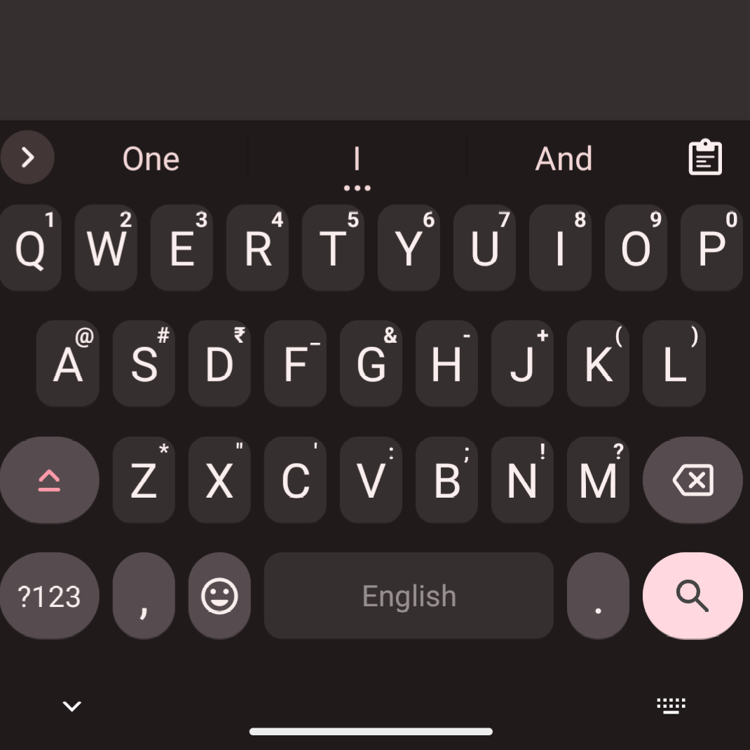
Why would you love your buttons to turn puke green? Or ugly red like in the screenshot? It made google chat unusably hideous for me.
I just really emphatically do not want the wallpaper to be coupled to anything else.
Well maybe the image above doesn't look good for you, but for me it does look fine, it is similar to how I have Gboard right now.
About the green yeah I can agree, at least you can tweak the colors whether it is rom side or with an app as mentioned above.