this post was submitted on 08 Oct 2023
275 points (91.8% liked)
Programmer Humor
32380 readers
1361 users here now
Post funny things about programming here! (Or just rant about your favourite programming language.)
Rules:
- Posts must be relevant to programming, programmers, or computer science.
- No NSFW content.
- Jokes must be in good taste. No hate speech, bigotry, etc.
founded 5 years ago
MODERATORS
you are viewing a single comment's thread
view the rest of the comments
view the rest of the comments

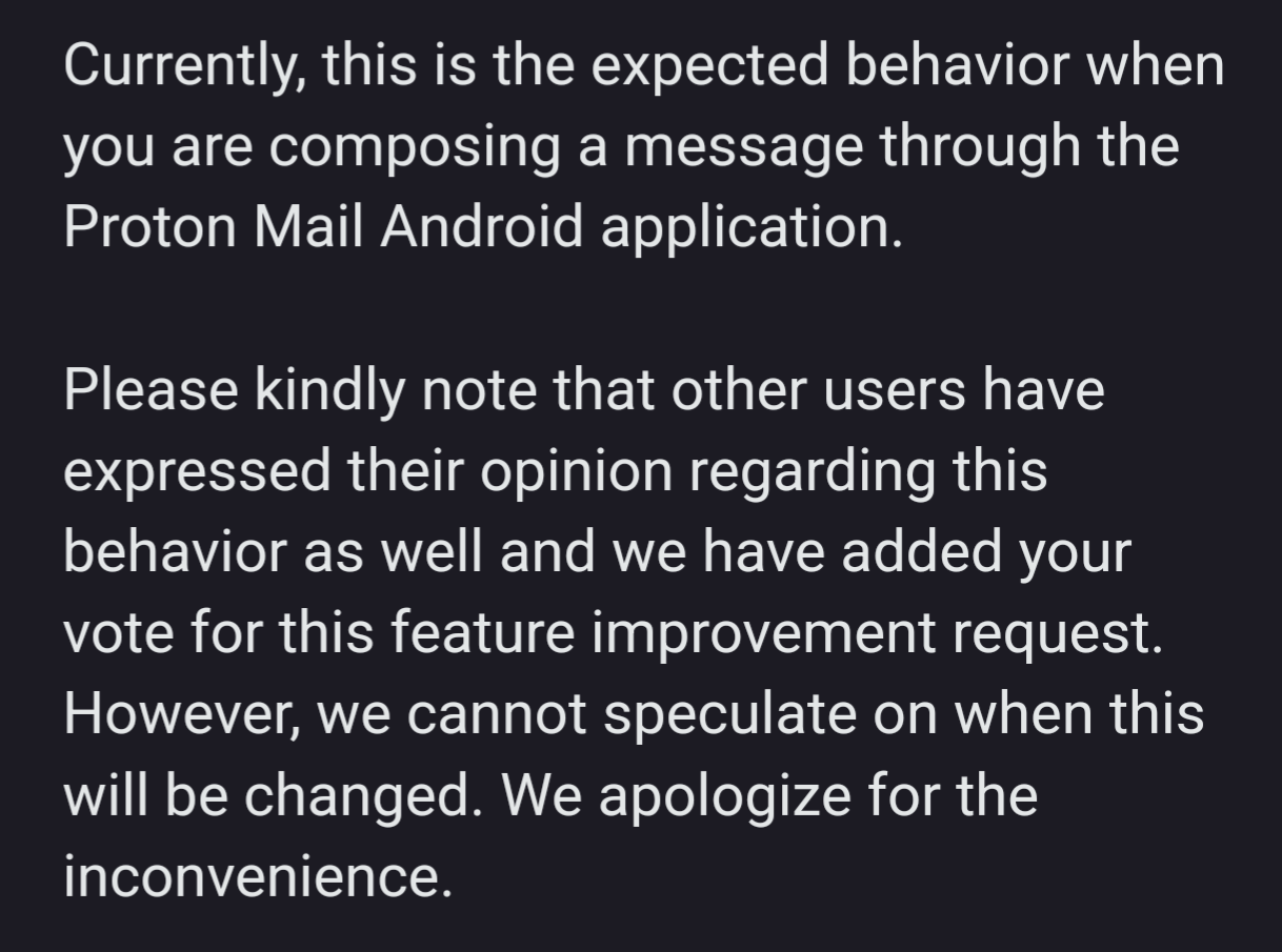
Why would anyone want that?
I'd be surprised if anyone did! I have asked them what the use case for this is and will reply back if they answer.
Maybe it's a technical problem that they're not interested in fixing. It could be unnecessarily reserving space for a signature, for example
Yes I would say it's most likely just a technical problem, I just found it funny they didn't come right out and say that.
My first thought was along those same lines but I do have both my personal signature and the mobile signature disabled in the settings.
Doesn't seem like that would be described as "expected" though. Unless they mean "expected because we don't give a shit."
I suppose there is a difference between "expected" and "intended".
It means you can click a line and type there, no need to press enter a few times first.
Not email, but if I'm taking notes in a text editor I will hold down enter at the start to ensure I can just click and type anywhere.
Now, if that pointless whitespace is being sent, I can imagine it annoying people in long email chains.
Well, this screenshot is the mobile version. Tapping anywhere in a textbox should bring the focus and start typing. All having extra lines does is make it more likely that the starting insertion point is a line or two below the start.
Even on desktop, I'm not aware of any text box behavior where you need to click on the correct line to bring the focus to the box.
This seems like a quick temporary pseudo-solution that removed an obstacle towards implementing some behaviour. Being temporary, it’s likely to outlive the feature it unblocked.