this post was submitted on 19 Sep 2024
262 points (83.4% liked)
Technology
71585 readers
3585 users here now
This is a most excellent place for technology news and articles.
Our Rules
- Follow the lemmy.world rules.
- Only tech related news or articles.
- Be excellent to each other!
- Mod approved content bots can post up to 10 articles per day.
- Threads asking for personal tech support may be deleted.
- Politics threads may be removed.
- No memes allowed as posts, OK to post as comments.
- Only approved bots from the list below, this includes using AI responses and summaries. To ask if your bot can be added please contact a mod.
- Check for duplicates before posting, duplicates may be removed
- Accounts 7 days and younger will have their posts automatically removed.
Approved Bots
founded 2 years ago
MODERATORS
you are viewing a single comment's thread
view the rest of the comments
view the rest of the comments


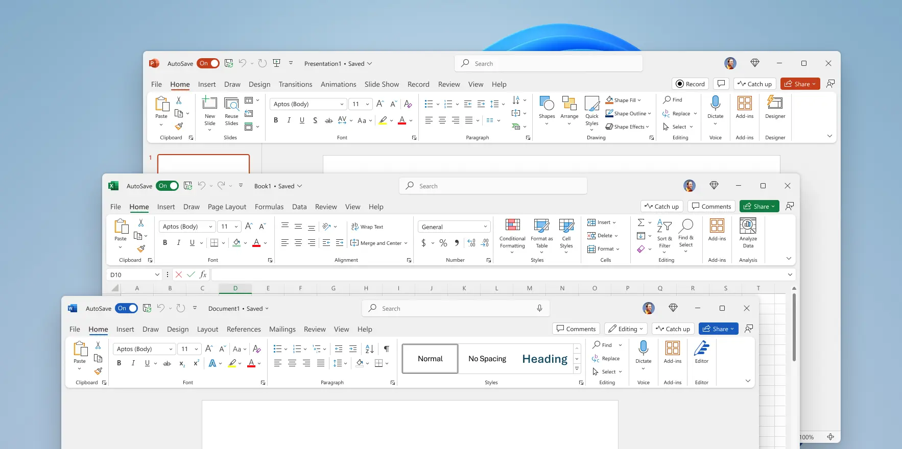
Contrast is Satan to designers, because being able to distinguish the zones of a UI messes with their perfect colour blocking.
Makes me think of people who want to cut down all trees along streets and replace all grass with concrete. So that all would be empty and similar and "in order".
By the way! I can see how this (color blocking) may resonate with one's ADHD and the stereotype that many designers have it.
But if any such a designer is reading this, I want them to understand that using their ... creations with ADHD is harder, not easier, than using normal, traditional UIs.
For the designer this may be a distracting and irritating contrast, because they have no use for information conveyed by it. For the user it's the opposite, they are distracted and irritated because of not being able to quickly find what they need.