Terrible Estate Agent Photos
Terrible photos listed by estate agents/realtors that are so bad they’re funny.
Posting guidelines.
Posts in this community must be of property (inside or out) listed for sale which contains a terrible element. “Terrible” can refer to:
-
the photo itself (finger over the lens, too far away, people in the shot, bad Photoshop, etc.)
-
the property (weird layout, questionable plumbing, unsound structure, etc.)
-
the interior (carpeted bathrooms, awful taste interiors, weird mannequins/taxidermies/art, inflatable pools indoors, etc.)
-
the actual listing itself including unusual descriptions and unrealistic pricing. However, this isn’t a community to discuss the housing market in general. This is a comedic community - let’s keep it light.
-
Photos can be sourced from anywhere and be any age, but please check they haven’t already been posted.
-
Censor any names/contact details of private individuals.
-
Mark the post NSFW if it includes nudity or sensitive content
Rules.
This community follows the rules of the feddit.uk instance and the lemmy.org code of conduct. I’ve summarised them here:
- Be civil, remember the human.
- No insulting or harassing other members. That includes name-calling.
- Respect differences of opinion. Civil discussion/debate is fine, arguing is not. Criticise ideas, not people.
- Keep unrequested/unstructured critique to a minimum.
- Remember we have all chosen to be here voluntarily. Respect the spent time and effort people have spent creating posts in order to share something they find amusing with you.
- Swearing in general is fine, swearing to insult another commenter isn’t.
- No racism, sexism, homophobia, transphobia, xenophobia or any other type of bigotry.
- No incitement of violence or promotion of violent ideologies.
view the rest of the comments

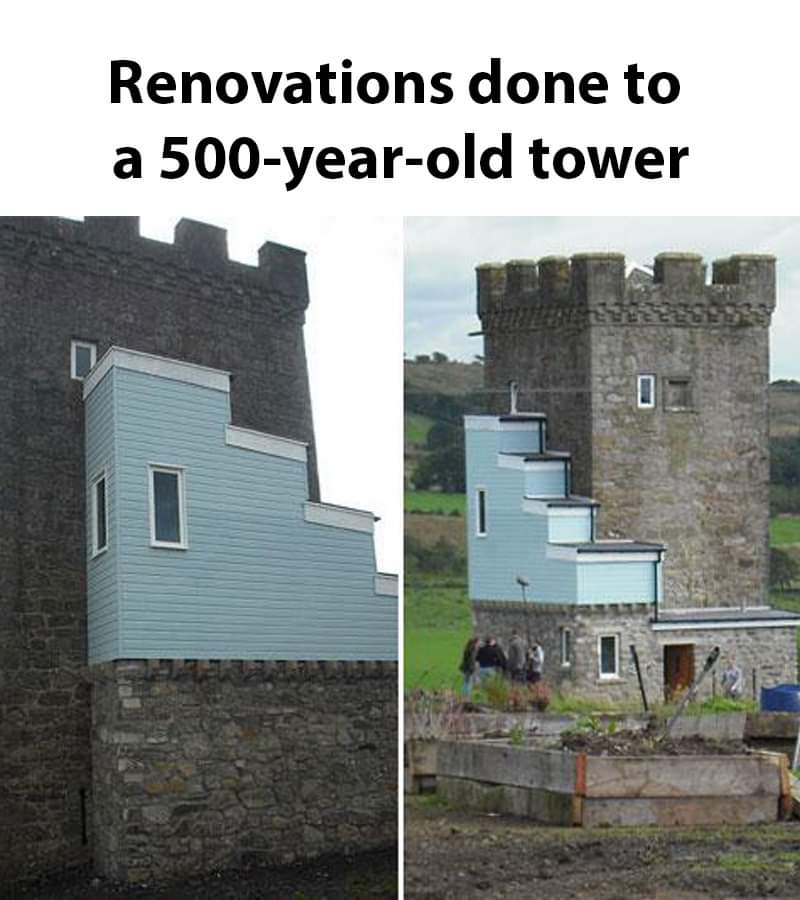
This has been floating around the internet for some time.
The funny part is that heritage zoning is the reason the addition looks the way it does. The upper floor was inaccessible and stairs needed to be added. Local regulations state that any additions must be visually distinct from the original structure so this monstrosity was the result.
Look up Caldwell Tower in Scotland for more information.
Why the fuck would additions need to be visually distinct?
Here is the episode of The Restoration Man that documented the project - they go into the planning side of this in-depth because it's really a head-scratcher. The owner tried many times to get planning for more subtle alternations but they kept getting knocked back because it has to be distinctive enough that it's clear what is the old building and what are the new additions. What you see is the result of that messy process.
Feels like the owner had enemies in the local administration