this post was submitted on 20 Feb 2024
985 points (95.6% liked)
Programmer Humor
32495 readers
798 users here now
Post funny things about programming here! (Or just rant about your favourite programming language.)
Rules:
- Posts must be relevant to programming, programmers, or computer science.
- No NSFW content.
- Jokes must be in good taste. No hate speech, bigotry, etc.
founded 5 years ago
MODERATORS
you are viewing a single comment's thread
view the rest of the comments
view the rest of the comments

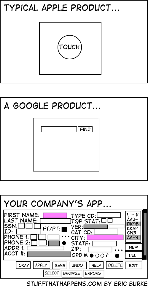
People at my company are like "why are we wasting screen real estate with white space?" and I imagine they see the last image is an ideal UX
Apple/Google/Other Companies way, way over-do this. Clean, modern design is one thing, but avoiding all text, making things too small to see, and being unable to tell which option is highlighted, etc, all at the expense of the actual UX is such an annoying trend and I'll never like it.
I'm a Millennial so of course I don't have a lawn, but get off it anyway...
I don't necessarily agree that they way overdo it, but I do agree those are all examples of bad UX design.