this post was submitted on 20 Feb 2024
1254 points (98.4% liked)
Programmer Humor
19564 readers
635 users here now
Welcome to Programmer Humor!
This is a place where you can post jokes, memes, humor, etc. related to programming!
For sharing awful code theres also Programming Horror.
Rules
- Keep content in english
- No advertisements
- Posts must be related to programming or programmer topics
founded 1 year ago
MODERATORS
you are viewing a single comment's thread
view the rest of the comments
view the rest of the comments

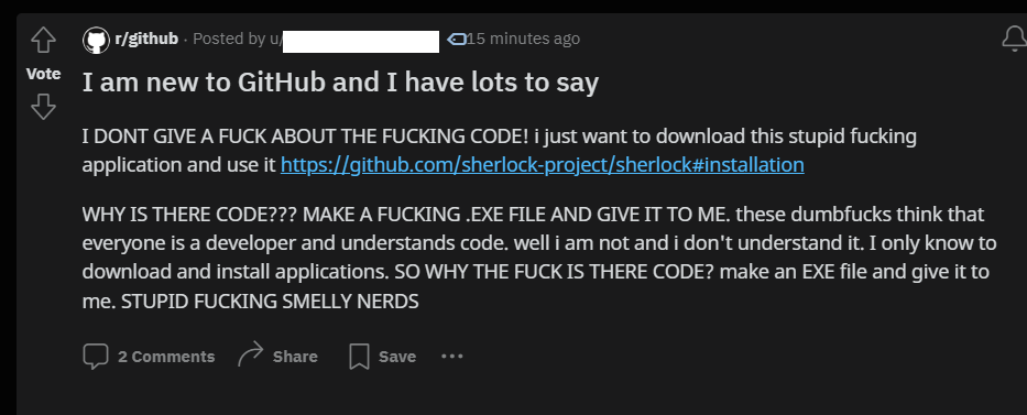
GitHub has bad UX for people who just wanna download and use the programs
I've bounced off GitHub more than once trying to figure out how to download the .exe file that I assumed must be somewhere. Honestly I still don't understand the interface and I've submitted bug reports for Jeroba on there. I might have even used GitHub for a project once? Every time I look at it it's overwhelming and confusing and none of it is self-explanatory. But, that's fairly true for a lot of stuff in programming.
If there is an exe, it's under the releases link. On desktop it's on the right sidebar below "About". On mobile it's at the bottom after the readme blurb.
It's not obvious because the code is the main focus and GitHub would much rather people host their releases somewhere else.
And even if releases are hosted on github, there should ideally be a download links page somewhere that presents the different binaries or installation files in an easier to understand format, especially if the software is designed for non-developers.